I was at the Port Byron rest stop on the Thruway, en route to the Syracuse show, getting coffee on Saturday morning when I noticed that the rebrand had gone live. NMRA leadership has been teasing it for weeks, without showing anything. The train show kept me busy all day, of course, but when I got to the hotel that night, I dug in for a closer look.
Ugh.
Forty years ago, I was a freshly-enrolled graphic design student, giddy at the prospect of someday sinking my teeth into corporate-identity projects, and churning out slick, oh-so-sophisticated designs. It seemed like pretty cool stuff at the time. Well, a variety of things happened along the way; I strayed off the academic trail and took a long, circuitous path from art-school student to production woodworker. Design still fascinates me, but I’ve come to view brand-identity projects as mostly self-important nonsense. Forget all that fussing with typefaces, Pantone colors, white-space ratios, and other minutia. Is the design distinctive? Does it convey the essential nature of the organization? If it does, nothing else matters. A good design could be made by an eight-year-old with a grease pencil.
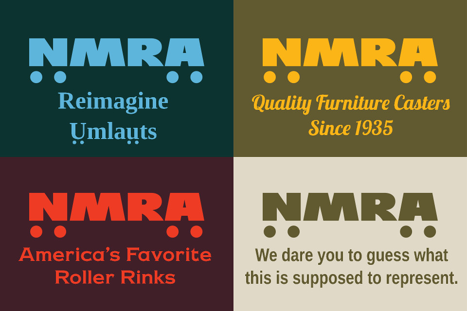
In the last 72 hours, I’ve already seen some takes that the NMRA “should have hired a professional” for this. I leafed through the 60-page Graphic Standards Guide, and it’s clear to me that they did hire a professional. The guide is filled with all the standard brand-identity stuff that professionals produce: the precisely-specified color palettes, the numerous do’s-and-don’ts, the pompous blathering about consistency in application. And yet, they completely failed to understand the assignment. The resulting logotype is four letters and four dots. It could be applied to nearly anything, and make about as much sense. Sure, you and I will probably interpret it as vaguely boxcar-shaped, but the rest of the world is going to be left guessing. It ought to scream “model railroads,” but it does not. What problem does NMRA leadership imagine that this will solve, exactly?

The design reminds me of a lot of graphic design from the 70’s trying to be simple lines while giving a cute reference to the nature of the product/service. What it really makes me think of is the Penn Central Logo. Which was supposed to be like couplers interlocking but everyone hates.
I actually don’t hate this logo, but really the only NMRA logo I like was the ancient wheel and coupler one and I don’t think that works well in the modern age. The past logo with the wheel outline looked nice but never felt like strong branding.
So I don’t really hate this, but I don’t see it as an improvement either.
LikeLike